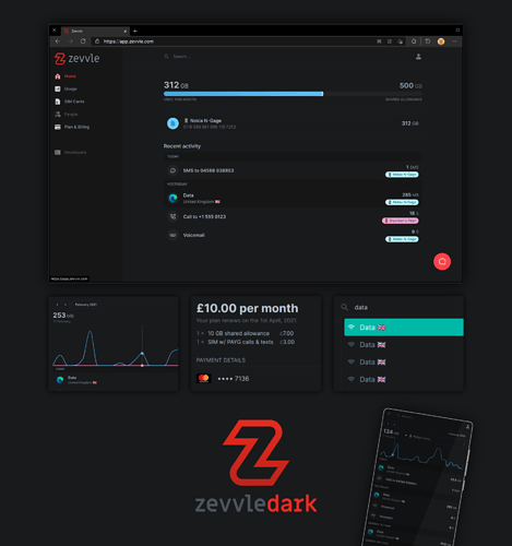
As with anything, a dark mode is needed: I mean, its like, the law, right? So I spent the evening screwing around with the webapp in Stylish and ended up with something I was pretty pleased with. Was mostly taking the appearance of Zevvle in MIUI’s dark mode as inspiration, as well as peppering in my own experience with painting up UIs.
Plus you get a poster you can hang on your wall.
Since the webapp is under heavy development, and there’s possibly an official dark mode in the works, I don’t want to tread on anyone’s toes by releasing it just yet, plus, its still a bit rough and the CSS is a tad – okay, very – messy. But if I get a thumbs up (@nick?), I’ll happily stick it on Userstyles.


