Data & NGN settings, SIM status info and other fixes 🪲

Hello there! A bunch of smaller stuff today (actually released over the last few days), but necessary nonetheless. Am working on some larger things behind the scenes before going live with this whole shebang.

New things

  • You can now update the data and non-geographic number (NGN) settings for a SIM.
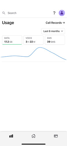
  • There’s now a link on the SIM card page to a graph of its usage
  • For multi-person accounts, there’s now an “Owner” column on the SIM cards table. We’ve also added an “Account Owner” badge to a person’s page.
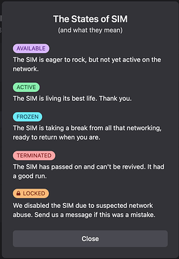
  • The SIM status is now clickable, and will open a modal explaining the different SIM card states:

Changes

  • To enable NGN or international settings, we’ve added a £5 minimum balance requirement.
  • We’ve added rate-limiting to the auth endpoint.
  • The roaming settings for a SIM are now hidden if the international & roaming option is disabled.

Fixes

  • For multi-person accounts on the usage graph, you can now only select another person’s SIM when the timescale is in months (the “Year to date” or “Last 6 months” options in the dropdown).

Back again :soon:

- Nick

6 Likes

Looking fab!

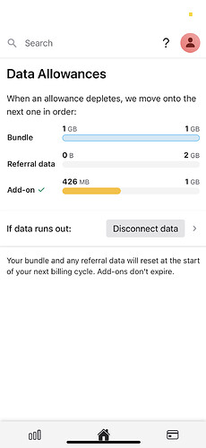
Did some exploring earlier and spotted a couple of oddities — add on data seems to be being used before referral data so maybe the order listed on the allowances page isn’t quite right (or there’s something special about the detective promo)?

Also, the navigation bar at the bottom is hard to use on notched iPhones — could do with tweaking to respect the ‘safe zone’ on the iPhone X style navigation widget thing (there are magic CSS variables described here which specify how much to inset: Designing Websites for iPhone X | WebKit)

Otherwise super responsive and I love it :slight_smile:

1 Like

Thank you for reporting that! Will send you a message re. the allowance usage, and I’ll look into getting the notch thingy fixed :blush:

EDIT: fixed.

1 Like

Would it be possible to add X and Y scales to this graph?

Showing the actual data points on the graph line would also help to make it easier to compare the usage of each month (maybe hide them when a large number of points), as the smoothing of the line makes it harder to see the difference of one month to the next.

Both of these are better (but still not ideal) on desktop when you can hover the mouse over the graph, but this doesn’t seem to work very well on mobile (iOS).

Thanks!

1 Like

Yes, the X axis should’ve been there already… looking into this.

Will see how I can fit some data points in; it might be too much for mobile though…

Noted; will get that touch/hovering working correctly.

Thank you :pray:

1 Like

The x-axis is back, and hovering/touching on mobile is much better — thank you for prompting this @jcwacky. Touch the chart anywhere and it’ll follow your finger wherever it is on the screen, so you can “scroll” below the chart without covering the action.

Also made it 10% taller. Haven’t tried with showing the data points yet, will see how that fares on desktop/mobile. :slight_smile:

3 Likes

Thank was quick! Thanks Nick. Yep, that’s much better.

When you tap and hold to see the value, could it stay on screen when you remove your finger, like the old iOS app did? This would feel more natural to me, and should help reduce the number of times I accidentally trigger the graph to “zoom in”.

1 Like

Good point, thanks James — the tooltip now stays, and is clickable too (previously it was only the graph split into equal sections). Should make “zooming in” more accurate…

Amazing, thanks Nick! Although, it still seems a bit finickety to get the tooltip to initially appear (on iOS at least). You can’t just tap (as this zooms in) or tap and hold (as this brings up text selection), and it seems you have to tap while sliding your finger sideways.

Maybe a single tap on the graph could show/move the tooltip at/to that point, and tapping on the tooltip would then zoom in?

(Sorry!)

1 Like

Done! :grin:

That actually works better too; “zooming in” should only work when pressing the tooltip, everything else should change its location.

Magic! Working very nicely now. Thanks Nick!

1 Like