Thursday, August 1st

App

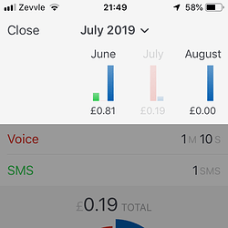
  • Past month summaries! If you head to the summaries (Usage tab > pie chart in the top right) and tap the header title, you can see your previous months’ usage. You can press the month as well to see more detail:

(Not my real usage… :bar_chart:)

  • We’ve removed the option to change a SIM’s data (3G, 4G, etc.) in preparation for an update coming soon. This isn’t permanent, and you’ll like the update…

Remember to force-refresh the app to see these changes :slight_smile:

5 Likes

The usage by month graph is nice except it can’t show usage over time. It currently only shows the reflate usage within the month.

1 Like

Yes…, although the feed currently has that graph (at least for data), which doesn’t really make sense to duplicate. For viewing call/message usage over time and easier-accessed historical usage it makes sense.

This then opens another question… should the feed even have a graph?

I suppose there’s different purposes for the 2 graphs. The feed one is a 30 day window of daily usage, whilst the other is a monthly summary and shows a longer term trend. Both uses are perfectly valid and useful.

Could a pinch gesture be used to change the scale of the feed graph?

Visualising temporal data is hard. Dare I say it was part of my Computer Science dissertation. Having multiple graphs or ways of showing the data is usually important, as a single graph will rarely show everything in a useful way. Each graph will have a different story to tell.

1 Like

Ah, did you mean a graph for total monthly usage? That would be useful.

It definitely could, and that’s probably the way to go without cluttering with buttons… I remember working on it a while back but moved on to more pressing things…

Mind if I ask what else was in your dissertation? :slight_smile:

I have been thinking this could be useful one there’s more data and when the amount of each is different.

I have wondered if the main graph could be total cost rather than just data. Possibly using a stacked chart So many options…

My usage is very spiky, so as you zoom out, you get a summary at different levels, such as weekly and monthly.

Could 2 or 3 finger drag do a scroll along to see info from previous months.

It was the visualisation of temporal data in a version control system (CVS - yet that rather old system that’s virtually never used now), think analysis tab for project on Github or similar.

2 Likes

You’re right with the options… I’ve been noting some ideas, no specific plans yet. In Monzo’s app I like how the feed slides down, which I could be tempted to steal borrow for additional graphs perhaps.

Could almost do with a cost/usage toggle which could affect feed items, the graph and summary. @smsm1 is there a benefit for you to seeing a graph of both at once?

With 3 different usage types, multiple SIMs, users, etc. things pile up quick… :sweat_smile:

1 Like

If there was a desktop sized screen it could be possible to display both at the same time, however harder to make it clear on a small screen.

1 Like