Hello!
This turned out to be a slightly bigger update than expected…
Shiny new things
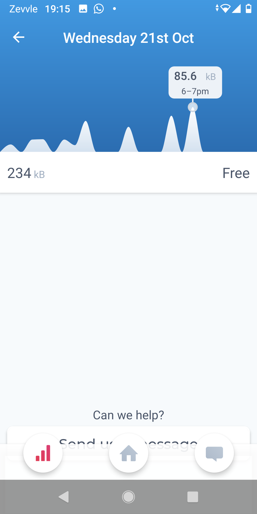
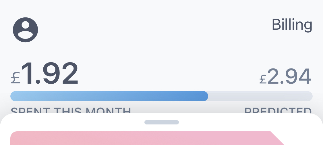
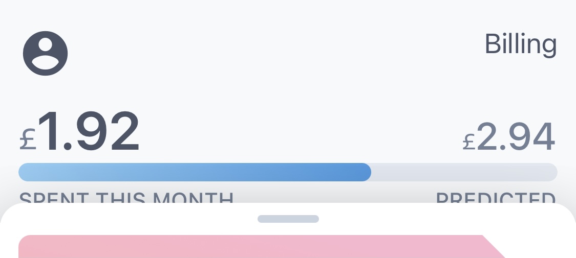
An improved account overview
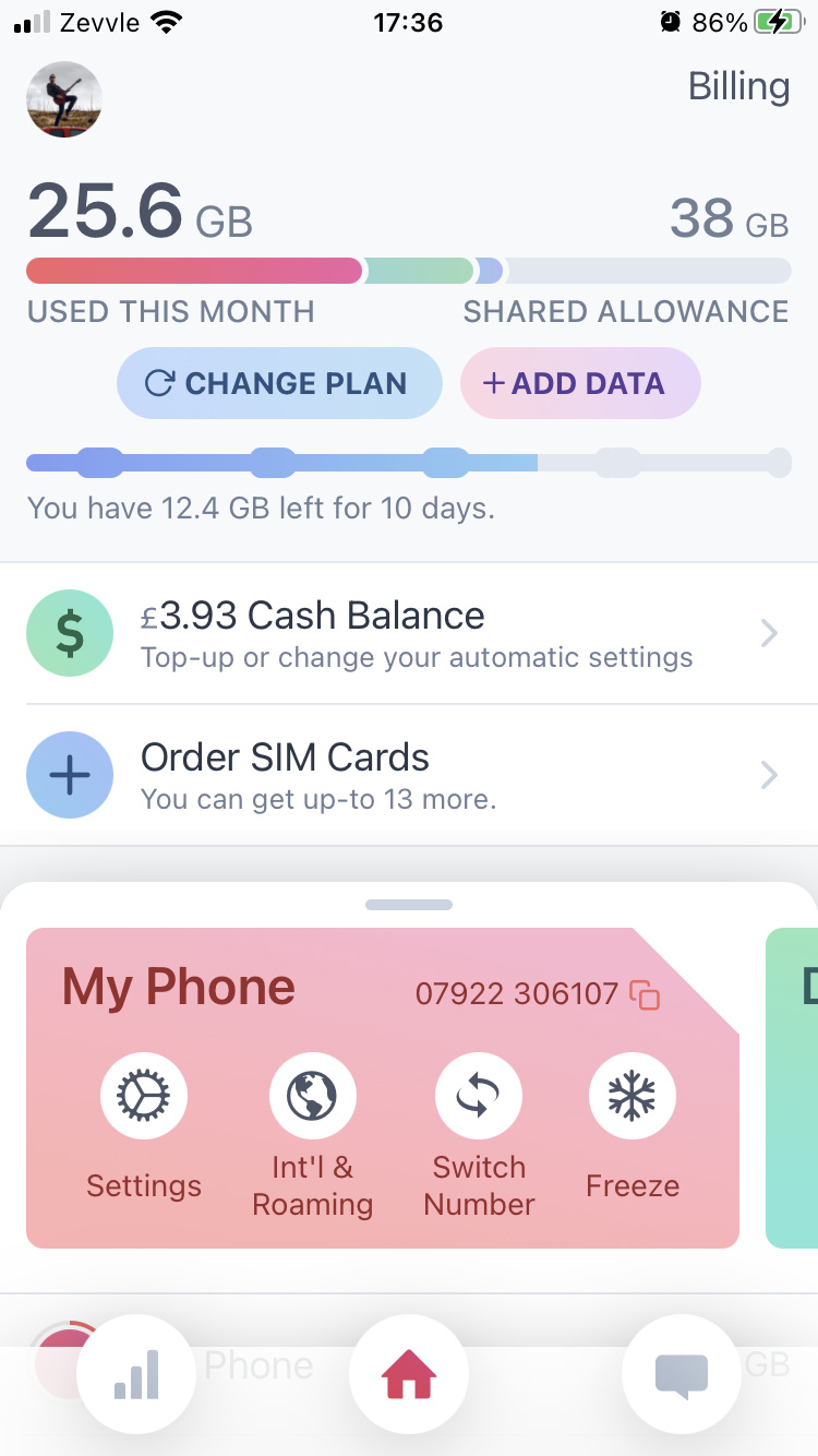
We’ve completely revamped the account screen with a new layout and design. Firstly, we’ve added a new SIM card slider with direct access to the settings and other options (this was nested in another screen previously). We’ve also highlighted the account usage portion based on the active SIM.
And behind the sliding card thingamajig (I’m sure it has a name):
- Added ‘Change Plan’ and ‘Add Data’ options that’ll take you to the relevant screens. Previously they were both hidden on another screen that you cryptically had to tap on the usage bar for.
- Added a month progress indicator with the amount of data you have left for how many days. The bobs/bulges are weekends.
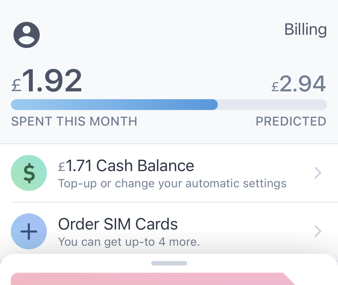
- Added a new ‘Cash Balance*’ page with options to top-up, set a monthly top-up and an automatic top-up if your balance is low. We used those for some older plans, but we had some requests to bring them back (especially now that some SIMs have PAYG calls and texts).
- Added the Order SIM Cards option which was previously on the billing page.
I’m not a huge fan of the term “cash balance,” so let us know if you have any suggestions! “Credit” feels a little vague…
A note on performance
The above changes require more computation for the layout, i.e. moar power is needed. We’ve tested on as many phones as we can and everything feels smooth, but can’t test all the 13,000+ devices we support. If it feels slow or janky please let us know — we haven’t gone to the nth degree to make the transitions performance-perfect, but we will do if necessary.
Payment history!
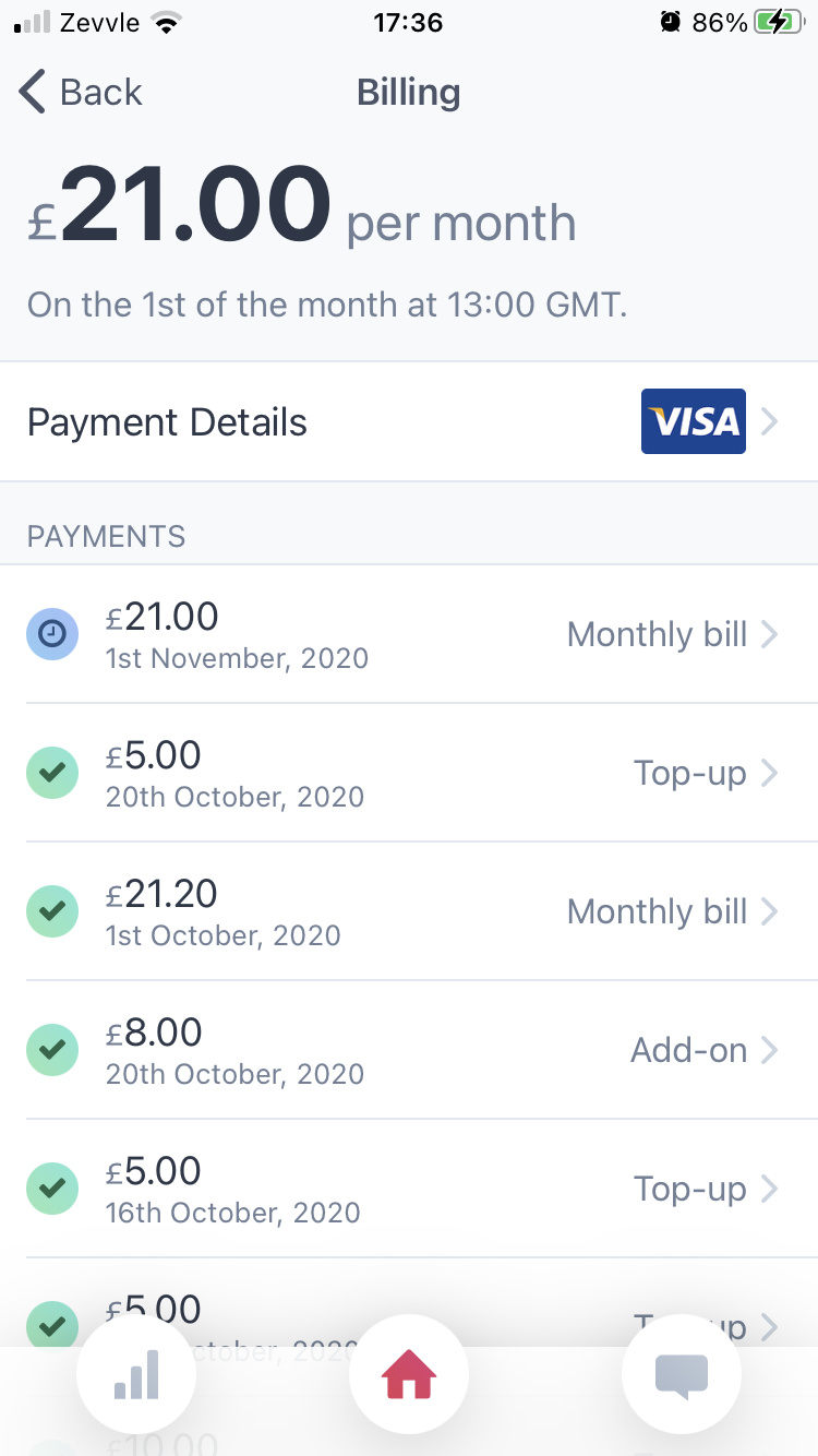
The billing tab looks a little different, and now includes a list of all your payments — past and upcoming. Each list item will take you to a new page with the breakdown. We haven’t yet added PDF receipts, stand by (let us know if this is important and we’ll get it done sooner).
Our billing setup has improved a lot over time, so if you see any discrepancies for older payments please let us know — we’ve gone through most of them manually, but it’s possible we’ve missed something, e.g. in the lines items for a payment. 
Changes
- The SIM card screen is no longer — you can access all the options at the account level with the 4 options, or under the settings in the case of changing its name and the notifications.
- Changing a SIM name no longer takes you to a separate page.
- Added a PAYG/Unlimited calls & texts button on the SIM settings page on shared plans that takes you to the plan selection screen. This flow, although hopefully better, still feels a little off…
- We removed that awful Contacts tab with the icky referrals section. Your invite link is now on the ‘Add Data’ page behind the sliding thingy on the account screen. This also means the statistics page for a contact is inaccessible — we’d like to add it back, but haven’t figured out where just yet. The tab bar also looks a little different.
- Changing card details is now one less step — as soon as you tap ‘Done’ on the popup we’ll change them instead of an extra step which some people found confusing.
- Instead of the nested Call Settings screen (with call waiting, holding, etc.), we’ve consolidated that with the regular SIM settings onto 1 screen.
- Updated orders & billing emails with separate line items for shared accounts instead of “10 SIMs sharing 3 GB.”
- Added a thank you page in-app when you sign up. Previously it went straight from “Hey we’ve taken your money” to “CAN WE SEND YOU NOTIFICATIONS?” which felt a little cold.
No longer broken
- There was a problem when selecting higher-usage plans. That issue is no more.
- Some call records were showing an hour later due to a timezone issue.
If you’re running version 1.2.2 the update should load automatically when you open the app, although it may take a moment to download as there’re quite a few changes.
Any and all feedback is much appreciated — we’d like to submit a new app store version to bundle in this update, but any changes we want to take care of them first!
You might not like the SIM colours which is 100% understandable — we’d like to make them customisable at some point. I’d quite like dark mode + pink & green SIMs…
 A ‘Ƶ’ icon is a better idea, too…